|
|
Pie Chart
A common plot that is frequently used in popular media is the pie chart, where the size of a "wedge of pie" helps the reader visualize the percentage of data falling in a particular category. Pie charts were once a mainstay in the Excel arsenal, but as analyses have become more evolved, the use of pie charts has dropped considerably. Bar plots typically illustratre the same data but in a format that is simpler to comprehend for the viewer. As such, I would recommend avoiding pie charts if at all possible. If your analyses do require a pie chart, then R can assist with the pie function. pie (NumericalVector) Example: > pie(state.area) 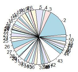
The resulting pie chart is very simple. However, users can define arguments to fully customize the appearance of the plot. Each argument is entered within the pie function and separated by a comma. When using the pie function it's often easiest to start with a standard template that lists the most common arguments with a NULL or DEFAULT value (example below). The user can then define whatever arguments they choose to customize the plot.
> pie (NumericVector, labels = NULL, edges = 200, radius = 0.8, clockwise = FALSE, col = NULL, border = NULL, main = NULL, lty = NULL ) IMPORTANT NOTES: The format of the above string includes extra returns after each argument. R does not recognize extra returns in a string, the extra returns are included to make visual identification of each argument quicker and easier. Common Bar Plot Arguments
Definitions and examples for a few of the more common arguments are provided in the table below. View the subpages under Data Visualization > Pie Chart to learn more about the use of these arguments in pie charts. |
