|
|
Dot Plot
A dot plot (aka dot chart) is an alternative to bar charts or pie charts, and look similar to a horizontal bar chart where the bars are replaced by dots at the values associated with each field. Compared to (vertical) bar charts and pie charts, dot plots allow more accurate interpretation of the graph by readers by making the labels easier to read, reducing non-data clutter and facilitating table look-up.
A simple bar chart can be created in R with the dotchart function. In the example below, data from the sample "precip" dataset is used to plot the annual precipitation of cities. dotchart(NumericVector, labels = NameVector) Example:
> library(MASS) 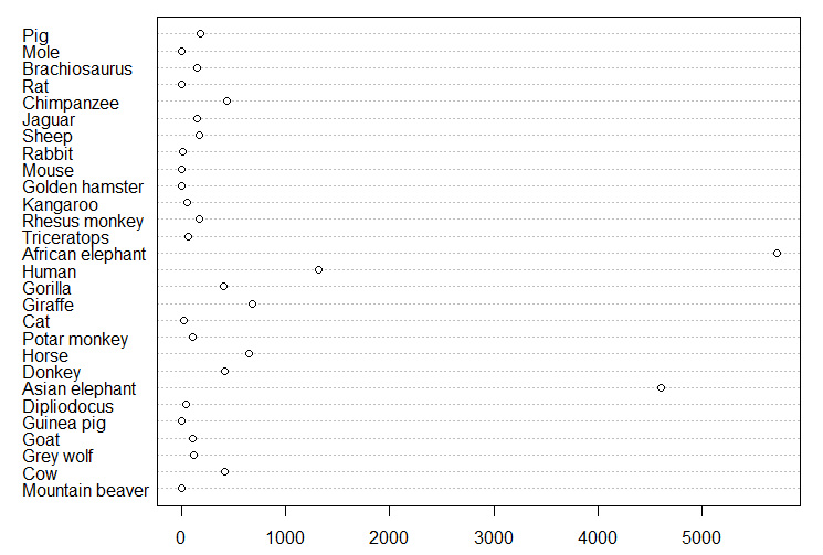
The resulting dot plot is very simple. However, users can define arguments to fully customize the appearance of the plot. Each argument is entered within the dotchart function and separated by a comma. When using the dotchart function it's often easiest to start with a standard template that lists the most common arguments with a NULL or DEFAULT value (example below). The user can then define whatever arguments they choose to customize the plot.
dotchart(NumericVector, IMPORTANT NOTES:
The format of the above string includes extra returns after each argument. R does not recognize extra returns in a string, the extra returns are included to make visual identification of each argument quicker and easier. Common Dot Plot Arguments
Definitions and examples for a few of the more common arguments are provided in the table below. View the subpages under Data Visualization > Dot Plot to learn more about the use of these arguments in dot plots.
Click to set custom HTML
|
