|
|
Customize Axis
The simplest form of the bar plot automatically populates the y-axis. The axis can be customized by the user per the following sections. Add X-Axis Labels
The simplest form of the bar plot doesn't include labels on the x-axis. To add labels , a user must define the names.arg argument. In the example below, data from the sample "pressure" dataset is used to plot the vapor pressure of Mercury as a function of temperature. The x-axis labels (temperature) are added to the plot. barplot(ElementContainingData, names.arg = ElementContainingNames ) Example: > barplot(pressure$pressure, names.arg = pressure$temperature) 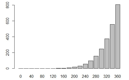
Define Y-Axis Limits
Default y-axis limits are defined by the barplot function. However, the limits can be defined by the user via the ylim argument. barplot(ElementContainingData, ylim = c( MinValue , MaxValue ) ) Example: > barplot(pressure$pressure, names.arg = pressure$temperature, ylim = c( 0 , 1000 )) 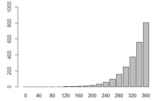
Define X-Axis Limits
The x-axis labels are defined by the user. Therefore, the x-axis is categorical by default, even if the labels are numeric. The x-axis limit can still be defined b the user with sequential categorical reference values and the xlim argument. barplot(ElementContainingData, names.arg = ElementContainingNames, xlim = c( BarNumberToStartAxis , BarNumberToEndAxis ) ) Example: > barplot(pressure$pressure, names.arg = pressure$temperature, xlim = c( 0 , 10 )) 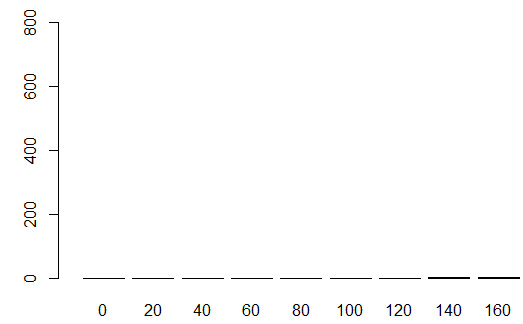
Change Y-Axis to Logarithmic
The y-axis can be defined as logarithmic using the log argument. barplot(ElementContainingData, log = "y") Example: > barplot(pressure$pressure, names.arg = pressure$temperature, log = "y") 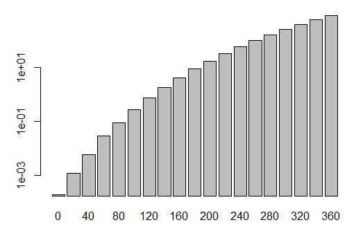
|
