|
|
Line Chart
A line chart (or XY Chart) is a type of chart which displays information as a series of data points connected by straight line segments. It is similar to a scatter plot except that the data points are ordered by their x-axis value and joined with straight line segments. A line chart is often used to visualize a trend in data over intervals of time, thus the line is often drawn chronologically. Note that line charts can be generated in R via the plot function.
plot ( NumericalVectorX, NumericalVectorY , type = "TypeOfLineChart") or plot (TimeSeriesVector, type = "Type of LineChart") Example:
> plot ( LakeHuron, type = "l") 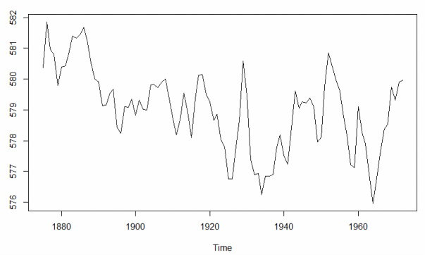
The resulting line chart is very simple. However, users can define arguments to fully customize the appearance of the plot. Each argument is entered within the plot function and separated by a comma. When using the plot function it's often easiest to start with a standard template that lists the most common arguments with a NULL or DEFAULT value (example below). The user can then define whatever arguments they choose to customize the plot.
plot(NumericVectorX, NumericVectorY, IMPORTANT NOTES:
The format of the above string includes extra returns after each argument. R does not recognize extra returns in a string, the extra returns are included to make visual identification of each argument quicker and easier. Common Line Chart Arguments
Definitions and examples for a few of the more common arguments are provided in the table below. View the subpages under Data Visualization > Line Chart to learn more about the use of these arguments in histograms.
|
