|
|
Bar Plot
A bar plot is a chart with rectangular bars with lengths proportional to the values that they represent. The bars can be plotted either vertically or horizontally. A simple bar chart can be created in R with the barplot function. In the example below, data from the sample "pressure" dataset is used to plot the vapor pressure of Mercury as a function of temperature. barplot(NumericVector) Example: > data() > barplot(pressure$pressure) 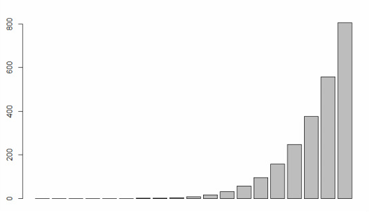
The resulting bar plot is very simple. However, users can define arguments to fully customize the appearance of the plot. Each argument is entered within the barplot function and separated by a comma. When using the barplot function it's often easiest to start with a standard template that lists the most common arguments with a NULL or DEFAULT value (example below). The user can then define whatever arguments they choose to customize the plot.
> barplot(NumericVector, names.arg = NULL, ylim = NULL, log = "", main = NULL, sub = NULL, xlab = NULL, ylab = NULL, width = 1, space = NULL, col = NULL, density = NULL, angle = NULL, axes = TRUE) IMPORTANT NOTES: The format of the above string includes extra returns after each argument. R does not recognize extra returns in a string, the extra returns are included to make visual identification of each argument quicker and easier. Common Bar Plot Arguments
Definitions and examples for a few of the more common arguments are provided in the table below. View the subpages under Data Visualization > Bar Plot to learn more about the use of these arguments in bar plots.
|